
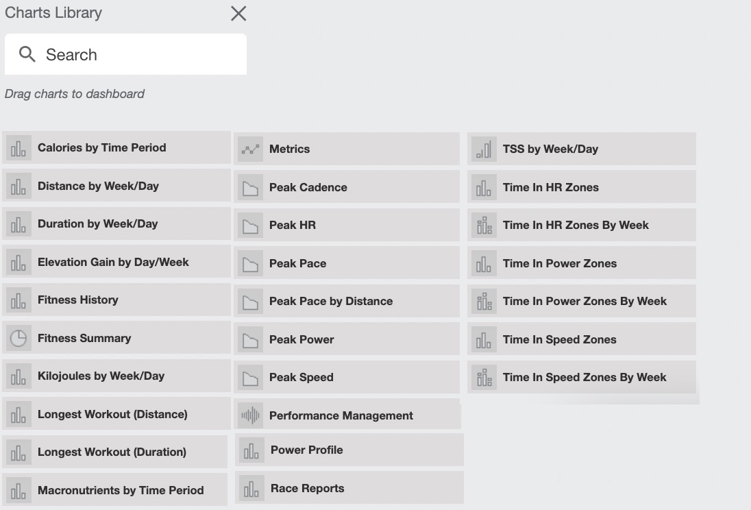
Open the chart library button to access the premade charts from Training Peaks.
At this point we highly recommend to take your time, do it old school: grab a paper and draw what's really useful for you. Try to make fit into rows. Our recommendation is:
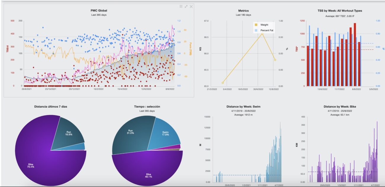
- 1st row for the Global PMC, metrics and overall volume for all sports.
- 2nd row for swimming: PMC & Volumes & Pacing.
- 3rd row for cycling: PMC & Volumes & Power curve.
- 4th row for running: PMC & Volumes & Pacing.
- 5th & Extra rows for miscellaneous.
Note that your dashboard design is not forced by the coach settings, it means that an athlete can have his/her own view while the coach has another custom dashboard.
In case that you want to copy your coach dashboard just contact us, we will send all the screenshots.
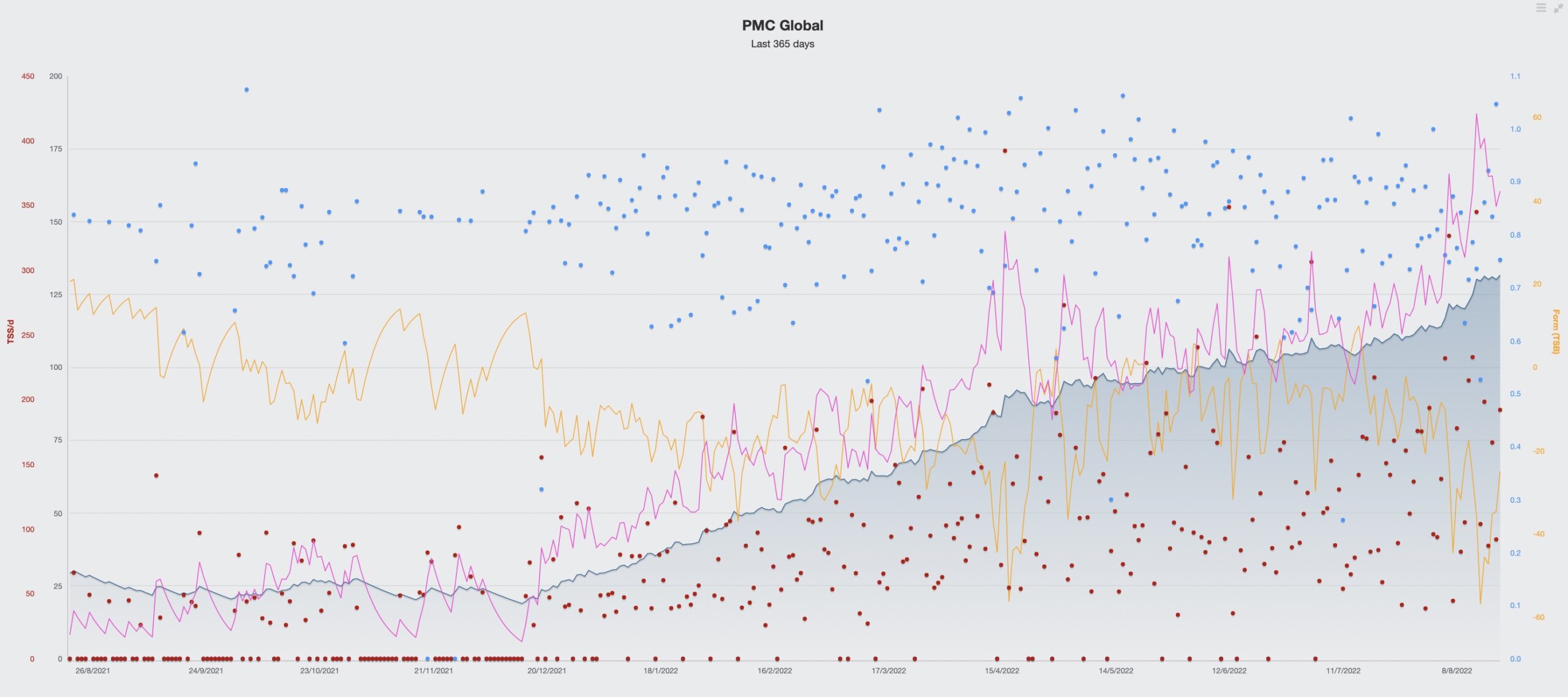
The PMC chart is the core of the TP dashboard, as the APP focus on the TSS - Training Stress Score, generated by each workout (its body effect punctuation).
- The rolling average of the cumulated TSS of the past 42 days is called the CTL - Chronic training load, the blue shaded area. This is our adaptation to the trainings, our "fitness".
- The rolling average of the cumulated TSS of the past 7 days is called the ATL - Acute training load, the purple line. This is the short negative effect of the workouts in terms of "fatigue". Once overcomed it's considered a positive factor CTL.
- To realize about the positive/negative stress balance of our workouts, we take a look to the yellow line, which is the TSB - Training Stress Balance.
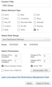
We can customize the chart with different sport filters, time frames and other values.
Don't worry your coach does this all for you, but also can explain the effects during the TRIMAX videocalls.
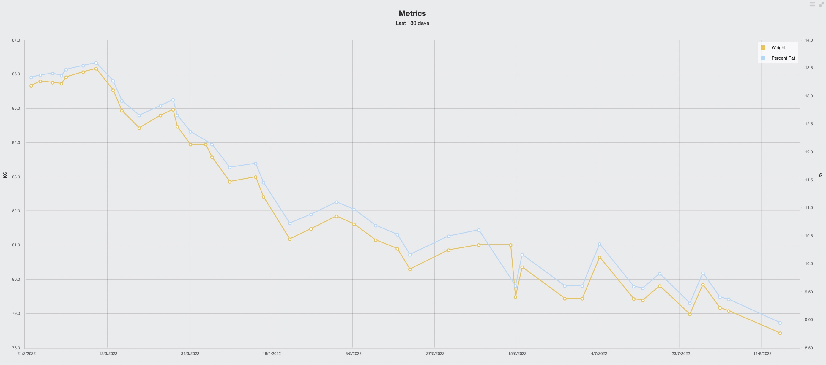
The metrics chart is also a key one, just because tracking the body weight, fat and other KPI's provided by scales, are quite requested by our athletes.
It has tons of channels to select. This information comes from scales, body monitors or LAB data that can be added manually in your metrics windows from the calendar.
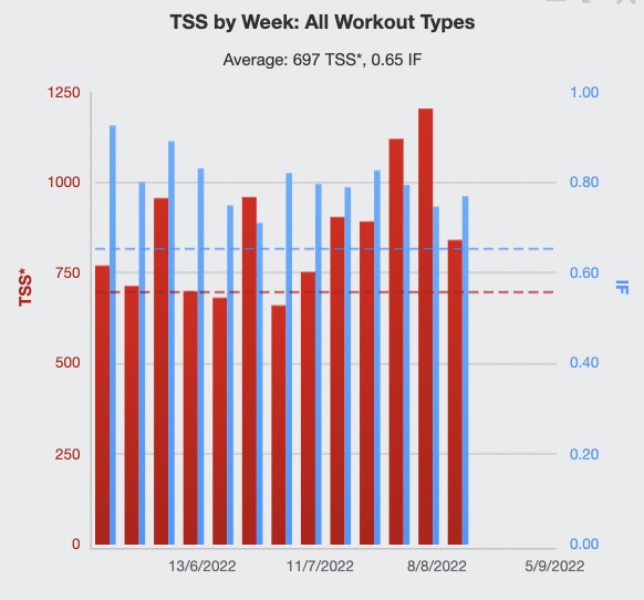
These charts provide information about the quantity of the time invested training.
Them can be set by TSS, kms, miles, hours, by sport, etc... We can also compare periods of time.
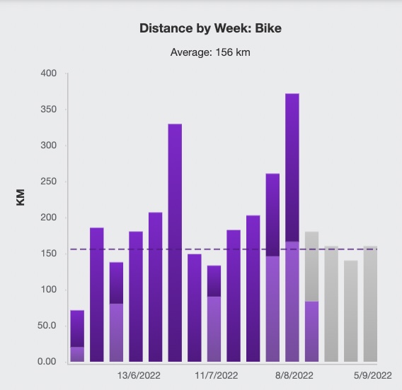
In this example we can see the volume in kilometers performed by one of our athletes.
The athelete followed two blocks increasing the training load, followed by a recovery period.
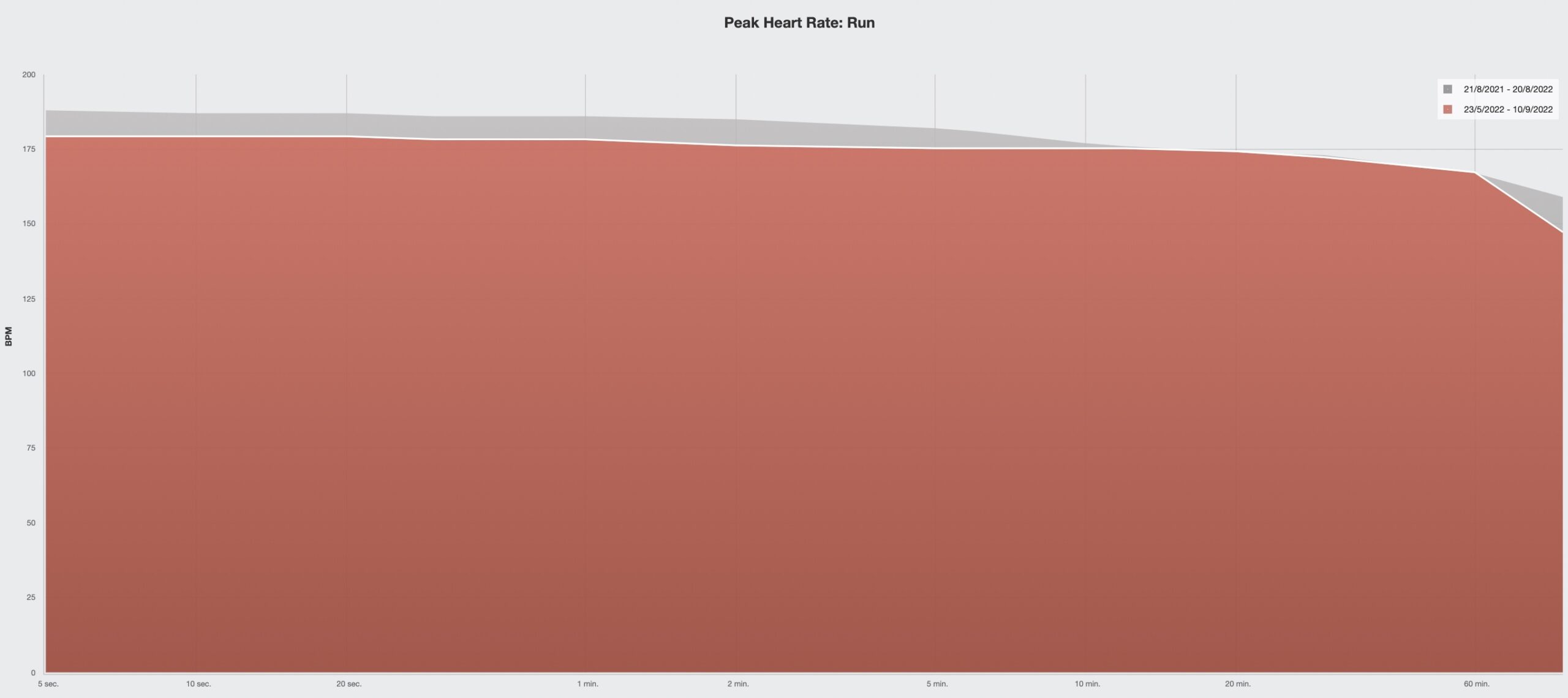
In the example we select a "Peak heart rate" chart and then apply the sport=run filter, plus the comparion option of the recent weeks over the last 365 days.
We often use this information to know if an athlete is focusing more in the short distance intensity or in the long distance adaptations. Thanks to this chart sometimes we realize the need to include some high intensity maintenance workouts.
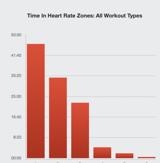
We can also study the run heart rate data from another perspective, like time expended by training zones.
In the example, we have data from an athlete preparing for a full distance Ironman event, so her training is focused in the endurance heart rate zones.
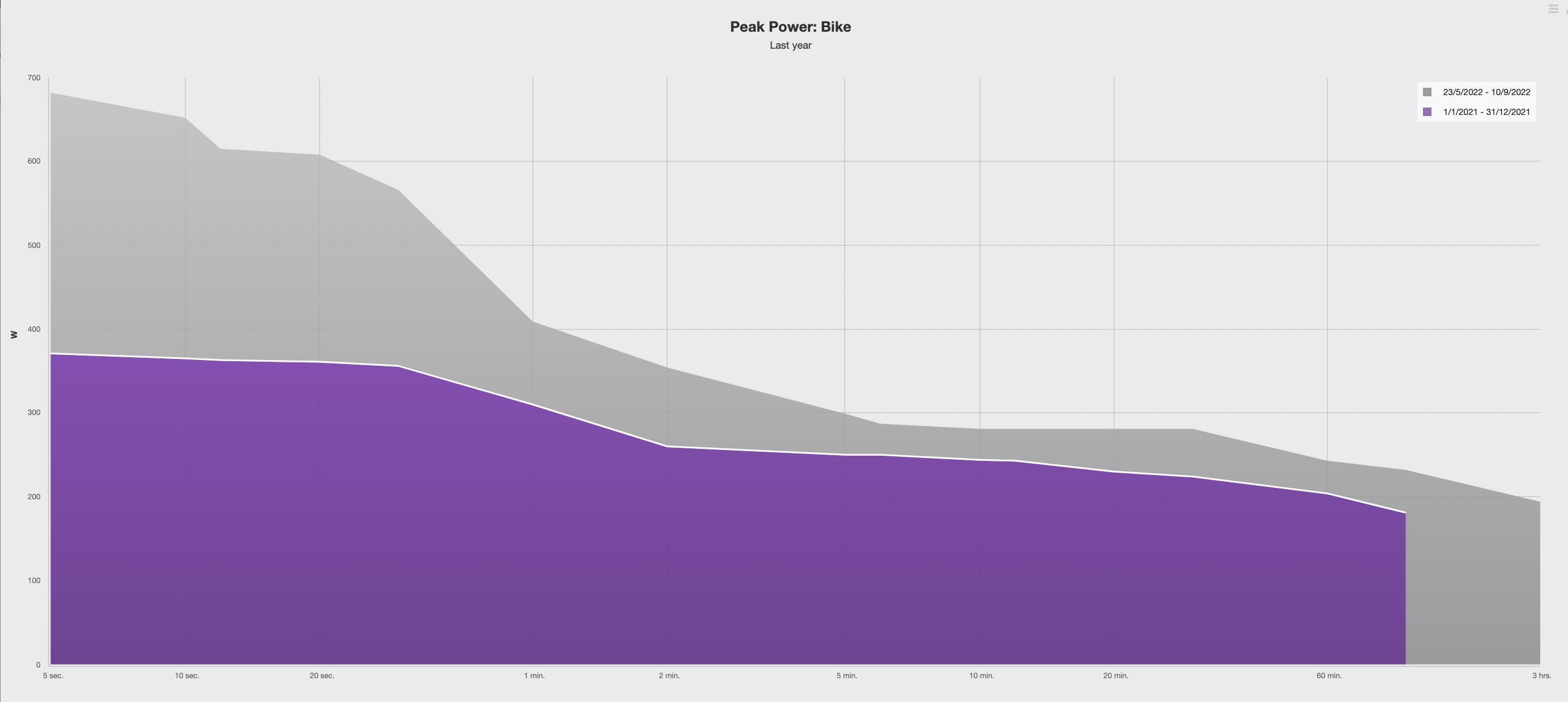
Performance charts are the result of the physiological adaptations. In cycling we will look at the power data presented as a power duration curve.
In the example, our triathlete has improved a lot his power values over the last 365 days.
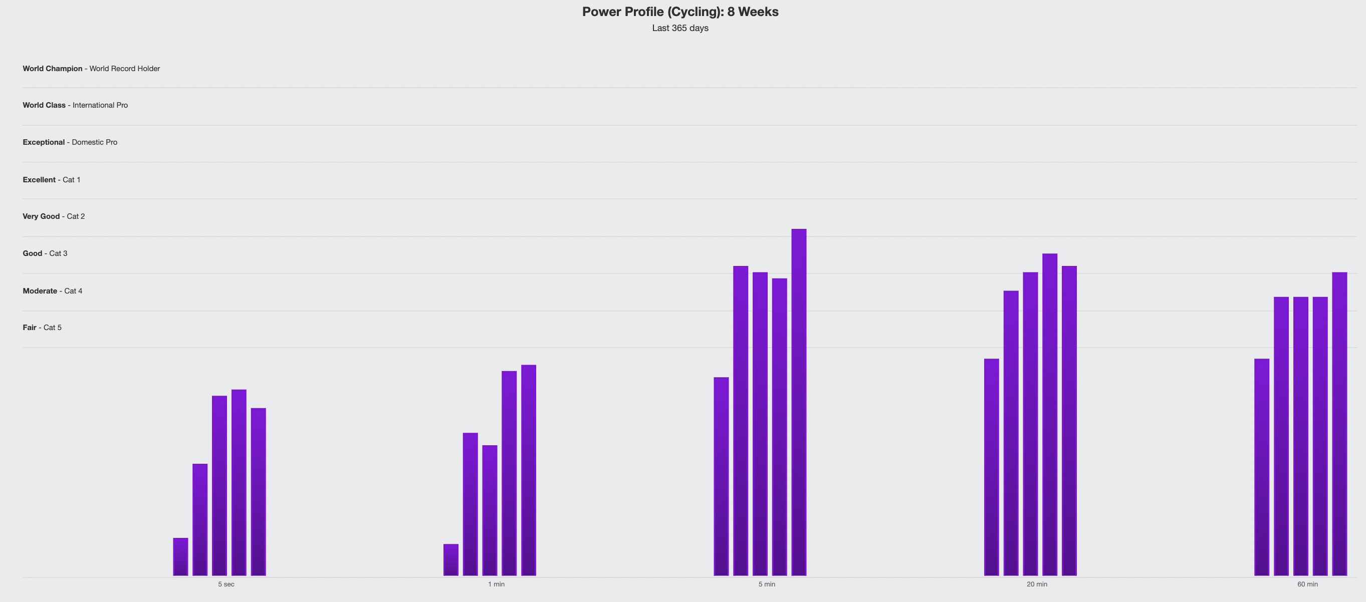
The power data is more useful in the relative form Power/Weight.
In the example, we can see that our triathlete highlights in longer durations over short power outputs, which is good when preparing for a long distance event as an Ironman.
Preseason could be a good moment to work on our weaknesses.